Introduction
If you want to improve your paintings instantly—no matter what medium you use—learning values is the fastest way.
Values decide how light or dark something appears. They create form, depth, drama, and realism. Even the most beautiful color palette fails if the values are wrong.
This guide will help beginners and intermediate artists understand values clearly, see them accurately, and use them confidently in their artwork.
What Are Values in Painting?
In simple terms:
👉 Value = the lightness or darkness of a color
Every object has a value, even if the color changes.
Values create:
- form
- depth
- mood
- focus
- contrast
If your painting looks “flat,” “dull,” or “off,” it’s usually a value problem, not a color problem.
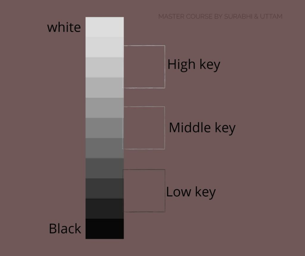
The 9-Value Scale (Artist Essential)
Artists generally use a 9-step value scale:
1 → darkest dark
9 → lightest light
Understanding this scale helps you compare tones in your reference and place them correctly in your painting.
Simplified approach: 3 Major Value Groups
For beginners, think in just 3 values:
- Light
- Mid-tone
- Shadow
If you can identify these three correctly, your painting will already look more realistic.
How to See Values Accurately
Most artists don’t “see” values correctly at first. Here are techniques professionals use:
1️⃣ Squint Your Eyes
The easiest and most powerful trick.
When you squint:
- details disappear
- colors merge
- only values remain
This helps you identify the true light, mid, and shadow areas.
2️⃣ Convert Your Reference to Black and White
You can use:
- phone filters
- Photoshop
- apps like Snapseed
Black & white strips away color distractions.
If the painting works in grayscale → it will work in color.
3️⃣ Use a Value Checker (DIY Card)
Cut a small window in a grey card.
Hold it over reference areas to compare values.
This prevents guessing and improves accuracy.
4️⃣ Use the “Thumb Test”
Hold your thumb against:
- your reference
- your painting
Compare which area is darker or lighter.
This works surprisingly well.
🎨 Why Values Are More Important Than Color
A strong painting doesn’t depend on thousands of colors.
It depends on a few strong value shapes.
Think about:
- Rembrandt
- Caravaggio
- Sargent
Their work is powerful because of bold value control, not fancy colors.
This applies to:
- oil painting
- watercolor
- acrylic
- gouache
- digital painting
✏️ How to Practice Values (Beginner Exercises)
1️⃣ Do 3-Value Thumbnail Sketches
Pick any reference. Make small sketches using only:
- Light
- Mid
- Shadow
This teaches simplification and composition power.
2️⃣ Paint a Grayscale Portrait/Still Life
Use only:
- black
- white
- maybe burnt umber
You’ll understand form much faster without color stress.
3️⃣ Block-In Big Shapes First
Do not start with details.
Place large shadow shapes first → then mid → then light.
This creates structure.
4️⃣ Reduce Your Colors
Use a limited palette like:
- Burnt Umber
- Ultramarine Blue
- Titanium White
This forces you to rely on values.
Values in Light & Shadow
Understanding how light behaves automatically improves values.
Light Areas:
- highest value
- softer edges
- warm temperature
Shadow Areas:
- lower value
- more color saturation
- cooler temperature
If you get the value relationships correct, your painting looks convincing.
Common Value Mistakes Beginners Make
❌ Too much white in highlights
❌ Shadows that are not dark enough
❌ No clear separation between light + shadow
❌ Details added too early
❌ Using color to solve a value problem
❌ Overblending everything
Correcting these instantly improves your paintings.
Pro Tips to Master Values
✔ Take photos of your painting and convert to black & white
✔ Don’t make every edge sharp—soft edges help value transitions
✔ Keep shadows unified
✔ Save bright highlights for the end
✔ Compare values, don’t guess
✔ Remember: edges + values = form
🌟 Conclusion
Understanding values is one of the most important fundamentals in painting. Once you learn how to see and control values, your artwork transforms—your portraits gain dimension, your landscapes feel atmospheric, and your still-life paintings look realistic.
Whether you’re a beginner or an aspiring professional, mastering values is the foundation of strong, confident painting.
Keep practicing thumbnails, grayscale studies, and value grouping. Over time, your eyes will naturally understand values without effort.
For more painting fundamentals, follow my blog and Instagram for daily tips, tutorials, and color mixing guides.