Color theory is not just about the color wheel, warm vs cool hues, or basic mixing.
Those things help—but they don’t explain why some paintings instantly feel harmonious, while others feel disconnected or dull.
This guide introduces color theory in a simple way, but with a deeper layer of artistic understanding—the kind that transforms your painting decision-making.
WHAT COLOR THEORY REALLY DOES FOR AN ARTIST
Most beginners think color theory is about “choosing the right colors.”
But professional artists know:
Color theory is a decision-making system.
It helps you control:
- where the viewer looks
- what emotion the painting communicates
- how depth is created
- how every color supports a unified visual language
This is why two artists can use the exact same color wheel
but one painting feels professional and the other feels amateur.
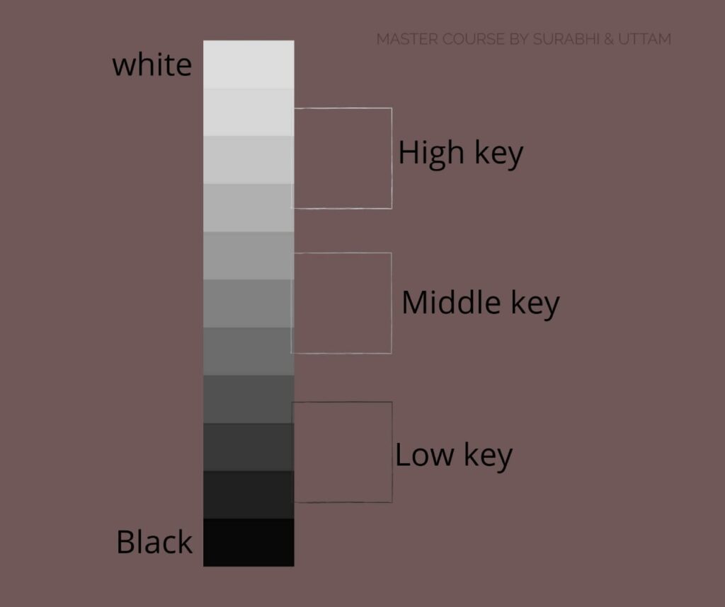
Most beginners only memorize the colors. But true color control comes from understanding: Hue, Value, Chroma & Temperature.
1. Hue
The “name” of the color (red, blue, green…).
Beginners stop here. Professionals don’t.
2. Value (Lightness/Darkness)
A color’s strength comes 70% from its value, not hue.
This is why a painting with “correct colors” can still feel wrong—
because the value was off.
(Value + Color = complete power.)
3. Chroma (Intensity)
This is the secret area almost no beginner studies.
High chroma = loud, emotional, vibrant
Low chroma = calm, atmospheric, sophisticated
Every subject has a natural chroma. Learn this, and your color choices instantly look intentional.
This is what separates “beginner color” from “artist color.”
4. COLOR TEMPERATURE
Most tutorials teach warm colors advance and cool colors recede.
That’s true, but shallow. Every color has a warm version and a cool version within itself. For example, Red is overall considered as a warm color, alizarine crimson is a cool version of red and cadmium or vermillion is warm red. The REAL magic happens when you learn to pair warm and cool versions of the same hue to create depth, form, and realism.
This is how professionals paint glowing skin, atmospheric landscapes, and realistic light.
COLOR HARMONY — THE PART MOST ARTISTS IGNORE
Everyone knows complementary, analogous, triadic…
But harmony is not just about “matching colors.”
Here are the real harmony concepts painters use:
1. Dominance
Every painting needs ONE dominant color family.
The rest support it.
Example:
A portrait dominated by cool violets, with touches of warm oranges only in the face.
This creates visual unity instantly.
2. Proportion
Professionals never use equal amounts of each color.
Example harmony plan:
- 70% neutrals
- 20% supporting hue
- 10% high-chroma highlight
This is why their paintings never feel chaotic.
3. Neutrals
Neutral colors are the glue holding the palette together.
Beginners avoid them.
Professionals rely on them.
Neutrals make your saturated colors glow instead of fighting each other.
WHY MUDDY COLORS HAPPEN — A MORE ADVANCED EXPLANATION
Beginners think mud happens from “mixing too many colors.”
That’s only half true.
Mud happens when:
- Chroma drops unintentionally
- Temperature shifts get confused
- Value relationships are ignored
- Opposite colors are mixed with no awareness of proportion
When you understand these 4 forces, muddy colors stop forever.
HOW TO REALLY PRACTICE COLOR THEORY (NOT THE BASIC WAY)
Here are exercises that truly change your color sense:
1️⃣ Mix high–medium–low chroma versions of the same hue
Teaches control, not guessing.
2️⃣ Paint a subject twice: warm-dominant and cool-dominant
Teaches emotional control.
3️⃣ Break your reference into warm/cool pathways
This is how professionals plan color before painting.
This is the kind of practice that transforms artists—not coloring the wheel.
FINAL THOUGHT:
COLOR THEORY IS YOUR ART’S LANGUAGE**
Most artists use color instinctively.
Professionals use color intentionally.
That’s the difference.
When you truly understand color theory, you don’t “pick colors”—
❗ You design them.
❗ You control the viewer’s eye.
❗ You build emotion through temperature, value, and chroma.
This is just the doorway into real color mastery. Color theory becomes powerful only when you know how to use it with intention. Your next level of painting starts with understanding color.
Inside my course, we go deeper into chroma control, temperature design, and professional color planning.
If you’re ready to paint with confidence, you’ll love what’s inside. Let me know if you are interested in my color theory class!
Happy painting!!